
 Fig 1
Fig 1Doesburg’s approach to De Stijl and its influence in his work: In order to better understand the artist’s approach of the movement, we have to know some of its basic principles and fundamentals. De Stijl was generally based on reductive geometry and asceticism in both form and color. Colors that were used in most De stijl works were basic primary colors (sometimes with the use of Black and White) that signified purism the movement sought.
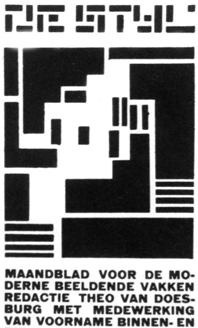
Fig 2
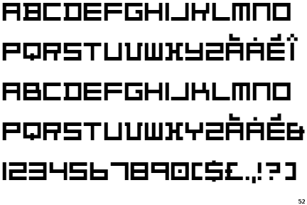
Fig 3
De Stijl Cover Page Design (1919): In the first version of De Stijl (fig 2), a logotype designed by Doesburg roughly sums up the principles of De Stijl in the way the letters are composed of geometric elements such as squares and rectangles. Together, the letters form the word De Stijl in a tight rectangular structure as well. Again, Doesburg implemented a similar approach based on a geometric scheme in a typeface he designed in 1919 (fig 3). The letters look like they were all designed to fit into a square, disregarding the rules of proportion in typography. (Eskilson, 2007, PP. 188-9)

Fig 4
The Maison Particulière (1923): The desire to establish a complete work of art representative of the harmony the group sought to achieve was a driving force behind Doesburg’s Maison Particulière. A collaborative work with Cornelis van Esteren. The design demonstrated some of De stijl’s principles in terms of contrast in color scheme and asymmetry in design (fig 4). Another example would be his “Color Design for a Shopping Parade and Café Restaurant” (fig #). (Eskilson, 2007, P. 190)
 Fig 5
Fig 5Prima Goudscha Kaas: A packaging for Gouda cheese designed by Doesburg in 1919 (fig 5).
The design was divided into four sections that were rotated in symmetry, and the intersection between the word Amsterdam and the company’s name in the horizontal and vertical axes gave the circle a cartwheel quality. The design showed dynamic from the repetition of the archer element across the design. (White, 2003, P. 86)


Fig 6
Composition (TheCow) Studies: Theo didn’t completely separate between the natural world and the pure harmonic geometry based on the artist’s ideals. In this series of three studies of a natural object (The Cow), Theo makes it clear that what might seem as a completely non-objective at the first look could be in fact the result of a natural observation that went through steps of simplification (fig 6). (Eskilson, 2007, P. 187)
 Fig 7
Fig 7
Arithmetic Composition I: In 1924 and under the influence of Lissitzky’s work, Van Doesburg introduced the diagonal element is his work for the first time (fig 7). This new approach contradicted with De Stijl’s principle of non-expressive and harmonic universal art. However, Doesburg’s justification for it was that it stood firm for De Stijl’s basic and first principle of “the unification of art and life”. (Frampton, 2007, P. 147)
Doesburg’s approach to Dada and its influence in his work (from 1920-1924): In general, Dadaists like De Stijl artists hoped to evoke a chane in society rather than just in art or literature. They sought to do so through liberating words from their meaning as they believed people’s trust in the general meaning of the word was the reason was propaganda was successful. (Kuenzli, 2006)
As Dadaists relied on randomness in their designs, De Stijl artists had a rational structure for their work. Therefore, Dada was considered to be the opposite of De Stijl in its destructive manner. However, that did not stop Doesburg from supporting and embracing the Dadaists style on several occasions. In 1920 Theo Van Doesburg organized a congress for “Constructivists” a word here referring to modernists in general from different art groups. The congress was attended by a number of Dadaists and a contact has been made between the two groups. As a result, I.K.Bonset (a pseudonym Doesburg adopted for his “Dadaist” hidden identity) appeared as a supporter of Dada and later the literary editor of the Dada magazine he founded Mecano (1922-1923). (Eskilson, 2007, PP. 193-4. Dickerman, 2006, P. 467)
His Work in relation with Dada:

Fig 8
Small Dada Evening (1922): A poster designed by Doesburg and Schwitterz promoting their performances around the Netherlands. The poster shows the chaotic and anarchist nature of Dada in the use of different typefaces in different sizes, overlapping in various axes (fig 8)(Eskilson, 2007, PP. 194-5)
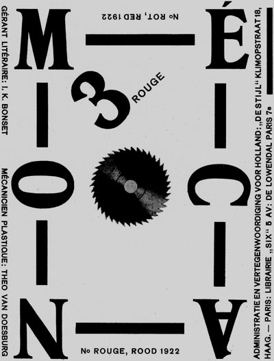
Fig 9
Mecano no.3 (1923):The cover of the third issue of the periodical Bonset published to promote his work as a Dadaist. The poster can be considered as a mixture of the two styles (De Stijl and Dada). The use of orthogonal structured typeface links the design to De Stijl. While other elements such as the rotation of letters and the centric saw blade serving as a symbol of the destructive nature of Dada clearly links the design to Dadaism (fig 9). (Eskilson, 2007, P. 195)
Composition 1: One of eight collages done by Van Doesburg and signed with his pseudonym I.K.Bonset. The work features elements of architecture and typography placed in a simple composition. Van Doesburg here used the technique of Photomontage, which was first introduced by the Dadaists (fig #). (Kuenzli, 2006)

The Story of the Scarecrow (1925): A collaborative work between Van Doesburg and Schwitterz (fig 11). The book told a simple story of a farmer frustration with his scarecrow inability to scare birds. The book was illustrated in typographical elements rather than pictorial ones giving letters materiality for being able to both tell a story and illustrate the content at the same time. (White, 2003, PP. 93-4)
Related Links:
Theo Van Doesburg's works on WikiMedia:
http://commons.wikimedia.org/wiki/Category:Theo_van_Doesburg
Theo Van Doesburg's written works from WikiSource:
http://en.wikisource.org/wiki/Author:Theo_van_Doesburg
Theo Van Doesburg's Manifesto originally published in De Stijl XII, 1924:
http://caad.arch.ethz.ch/teaching/nds/ws96/exercises/nds9606/text/Theo_manifesto.html
Christian Dior Particuliere Perfume Collection:
Nike De Stijl shoes:
http://bnycblog.com/2008/11/nike-dunk-low-pro-sb-piet-mondrian-304292-702/
Images retrieved from:
http://commons.wikimedia.org/wiki/Category:Theo_van_Doesburg
http://www.nytimes.com/slideshow/2006/06/15/arts/20060616_DADA_SLIDESHOW_1.html
No comments:
Post a Comment